


This demo uses Qt Quick components and Qt Mobility's QML bindings to create a simple music player. The Qt Quick components are used for the user interface. Qt Mobility APIs are used for other parts of the functionality: Multimedia API for audio playback and Document Gallery API for retrieving the audio files on the device. A simple file picker is implemented for platforms that don't have document gallery support. For more information about Qt Mobility, please download sources and follow build instructions included in the package: http://qt.nokia.com/products/qt-addons/mobility. QML's built-in Local Storage API is used to save settings when the application is closed and to load them again on application startup.
The user interface supports different orientations and resolutions. It is built with the following Qt Quick components: Window, Page, PageStack, Button, CheckBox, Menu, ToolBar, ToolBarLayout, ToolButton, Slider, StatusBar and ScrollDecorator.
Known Issues: Some issues with playback on Windows.
Source: Browse here
The application is mostly written in QML but has a little C++ code as well. The C++ part includes the main.cpp which is always needed in a Qt Quick application to view the main QML file. In this demo it loads the mainwindow.qml file. Before loading the main QML file, a context property "documentGallery" is set to the root context providing information on whether the document gallery is supported or not. This information is used in mainwindow.qml to dynamically create either the document gallery page or the file picker page. If FULLSCREEN is defined, then the demo will be compiled to run in fullscreen mode. Both FULLSCREEN and DOCUMENT_GALLERY are enabled for Symbian in musicplayer.pro.
 #include <QtDeclarative>
 #include "mediakeysobserver.h"

 int main(int argc, char **argv)
 {
     QApplication app(argc, argv);
     app.setApplicationName("MusicPlayer");

     QDeclarativeView view;
     QDeclarativeContext *context = view.rootContext();

     qmlRegisterType<MediaKeysObserver>("MediaKeysObserver", 1, 0, "MediaKeysObserver");

 #ifdef DOCUMENT_GALLERY
     context->setContextProperty("documentGallery", QVariant::fromValue<bool>(true));
 #else
     context->setContextProperty("documentGallery", QVariant::fromValue<bool>(false));
 #endif

     view.setSource(QUrl("qrc:///qml/mainwindow.qml"));

 #if defined(FULLSCREEN) || defined(Q_WS_SIMULATOR)
     view.window()->showFullScreen();
 #else
     view.window()->show();
 #endif

     QObject::connect(view.engine(), SIGNAL(quit()), &view, SLOT(close()));

     return app.exec();
 }
In addition to the main.cpp file, the application has one C++ class called MediaKeysObserver which is used to make media key events of a device accessible from QML. Media key events include the up/down volume keys on a device and headset remote control. Qt resource system is used to wrap the QML and image files into a single binary.
The functional parts of the application are implemented in the Player.qml and storage.js files. Player.qml encapsulates a component that provides the API for audio playback and playlist functionalities. storage.js provides the API for storing and retrieving the playlist and settings using the Local Storage API. The storage.js is used by the Player component.
The user interface of the Music Player is made up of a mainwindow containing a StatusBar, a PageStack that manages three pages, and a ToolBar.
The mainwindow's root item is a Window component. This provides orientation support for the application. The three pages that are used in conjunction with the page stack are controlsPage, playlistPage and musicPickerPage. musicPickerPage is dynamically created on application startup from GalleryPage or FilePickerPage components depending on the document gallery support. They are all instantiated from the mainwindow.qml. mainwindow.qml also creates an instance of the Player component and pushes the controlsPage instance to the pagestack as the initial page. In case an empty playlist is loaded, the playlistPage and the musicPickerPage instances are pushed onto the page stack. This way the music player starts directly from the view where the user can add songs to the playlist.
 import QtQuick 1.1
 import com.nokia.symbian 1.1
 import MediaKeysObserver 1.0
 import "Storage.js" as Storage

 Window {
     id: mainwindow

     property Item musicPickerPage

     Player {
         id: player
         onPlaylistLoaded: {
             if (player.playlistModel.count == 0) {
                 pageStack.clear()
                 pageStack.push([controlPage, playlistPage, musicPickerPage])
             }
         }
         Component.onCompleted: {
             Storage.initialize()

             Storage.getPlaylist(playlist)
             playlistLoaded()

             var res = Storage.getSetting("volume")
             if (res != "Unknown")
                 volume = parseFloat(res)

             res = Storage.getSetting("repeat")
             if (res != "Unknown")
                 repeat = res == "true"

             res = Storage.getSetting("shuffle")
             if (res != "Unknown")
                 shuffle = res == "true"

             res = Storage.getSetting("index")
             if (res != "Unknown") {
                 index = parseInt(res)
                 refreshSong()
             }
         }

         Component.onDestruction: {
             Storage.setSetting("volume", volume)
             Storage.setSetting("repeat", repeat)
             Storage.setSetting("shuffle", shuffle)
             Storage.setSetting("index", index)
             Storage.setPlaylist(playlist)
         }

         MediaKeysObserver {
             id: mediakeysobserver

             property int key

             onMediaKeyClicked: {
                 switch (key) {
                 case MediaKeysObserver.EVolIncKey:
                     audio.volume += 0.1
                     break

                 case MediaKeysObserver.EVolDecKey:
                     audio.volume -= 0.1
                     break

                 case MediaKeysObserver.EStopKey:
                     stop()
                     break

                 case MediaKeysObserver.EBackwardKey:
                     previous()
                     break

                 case MediaKeysObserver.EForwardKey:
                     next()
                     break

                 case MediaKeysObserver.EPlayPauseKey:
                     if (playing)
                         pause()
                     else
                         play()

                     break
                 }
             }

             onMediaKeyPressed: {
                 mediakeysobserver.key = key
                 timer.start()
             }

             onMediaKeyReleased: {
                 timer.stop()
             }
         }

         Timer {
             id: timer
             interval: 300
             repeat: true
             onTriggered: {
                 switch (mediakeysobserver.key) {
                 case MediaKeysObserver.EVolIncKey:
                     player.volume += 0.1
                     break

                 case MediaKeysObserver.EVolDecKey:
                     player.volume -= 0.1
                     break
                 }
             }
         }
     }

     StatusBar {id: statusbar}

     PageStack {
         id: pageStack

         anchors.top: statusbar.bottom
         anchors.left: parent.left
         anchors.right: parent.right
         anchors.bottom: toolbar.top
         toolBar: toolbar

         ControlsPage {
             id: controlPage

             playlistVisible:  !inPortrait
             backgroundImage: inPortrait ?  "qrc:///qml/images/bg_prt.png" : "qrc:///qml/images/bg_lsc.png"
         }

         PlaylistPage {
             id: playlistPage
             backgroundImage: inPortrait ?  "qrc:///qml/images/bg_prt.png" : "qrc:///qml/images/bg_lsc.png"
         }

     }

     ToolBar {
         id: toolbar

         anchors.bottom: parent.bottom
         anchors.left: parent.left
         anchors.right: parent.right
     }

     //Set the image manually as there is no binding to musicPickerPage created
     //dynamically below
     onInPortraitChanged:{
         if (musicPickerPage)
             musicPickerPage.backgroundImage = inPortrait ?  "qrc:///qml/images/bg_prt.png" : "qrc:///qml/images/bg_lsc.png"
     }

     Component.onCompleted: {
         // Create the musicPickerPage depending on document gallery support
         var musicPicker = documentGallery ? "GalleryPage.qml" : "FilePickerPage.qml"
         var musicPickerComponent = Qt.createComponent(musicPicker);
         musicPickerPage = musicPickerComponent.createObject(pageStack)
         musicPickerPage.backgroundImage = inPortrait ?  "qrc:///qml/images/bg_prt.png" : "qrc:///qml/images/bg_lsc.png"
         pageStack.push(controlPage)
     }
 }
MediaKeysObserver is used in the mainwindow to map the media key events to corresponding actions.
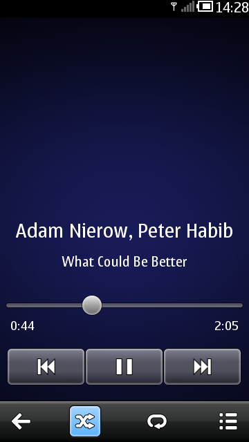
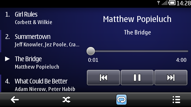
ControlsPage is the main interface of the Music Player. It provides controls for seeking, playing, pausing and jumping to the next or previous song. In landscape orientation, the ControlsPage also contains a simplified playlist that the user can browse and pick songs from. The toolbar in ControlsPage allow the user to quit the application, toggle shuffle and repeat modes on and off and navigate to the playlist page.
ControlsPage and all the other pages have a Page component as their root item. The Page component has a property "tools" which is assigned an instance of ToolBarLayout. This ToolBarLayout defines the toolbar for that page and automatically positions it's contents.
 Page {
     tools: controlsTools
Inside the ToolBarLayout is a set of ToolButtons with appropriate images or text and actions assigned to them. The ToolButtons also have properties defining whether they have a border image and if the buttons should be checkable, and in case of checkable buttons, if the button is checked or not.
 ToolBarLayout {
     id: controlsTools

     ToolButton {
         flat: true
         iconSource:"qrc:///qml/images/tb_back.svg"
         onClicked: Qt.quit()
     }

     ToolButton {
         flat: true
         iconSource: "qrc:///qml/images/tb_random.svg"
         checkable: player.count > 1
         checked: player.shuffle
         onCheckedChanged: player.shuffle = checked
     }

     ToolButton {
         flat: true
         iconSource: "qrc:///qml/images/tb_repeat.svg"
         checkable:true
         checked: player.repeat
         onCheckedChanged: player.repeat = checked
     }

     ToolButton {
         flat: true
         iconSource: "qrc:///qml/images/tb_list.svg"
         onClicked: pageStack.push(playlistPage)
     }
 }
The song position indicator can also be used for seeking within a song. It is implemented using the Slider component. The maximum value of the slider is bound to the duration of the current song. The song duration is measured in milliseconds so, to make a step size of one second, the stepSize value is set to 1000 (milliseconds). The slider value is not directly bound to the player.position but instead a Binding element is used because we want the slider value to track the song position only when the slider is not dragged. In order to allow smooth dragging, the seek function only takes effect after dragging has finished. This also prevents a binding loop from occurring.
 Slider {
     id: slider

     anchors.top: parent.top
     width: parent.width
     maximumValue: player.duration
     stepSize: 1000

     onPressedChanged: {
         if (!pressed)
             player.position = value
     }

     Binding {
         target: slider
         property: "value"
         value: player.position
         when: !slider.pressed
     }
 }
The playlist views in ControlPage and in PlaylistPage are defined in a separate Playlist component to prevent duplicating code. The simplification of the playlist in ControlPage is accomplished by querying the listview's width in the delegate and hiding song durations accordingly. A ScrollDecorator component is used in conjunction with the Playlist's ListView element to provide information about the current position in the list while scrolling or flicking.
 ListView {
     id: listview

     anchors.fill: parent
     model: player.playlistModel
     delegate: playlistDelegate
     currentIndex: player.index
     cacheBuffer: height
     clip: true
     highlightMoveDuration: 500

     ScrollDecorator {
         flickableItem: parent
     }
 }
The PlaylistPage provides a full screen playlist view with controls to add and remove songs.
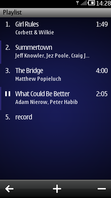
Removing songs is done by switching to the remove mode, selecting the songs to be removed and then confirming the removal. A custom property numOfSelectedItems is used to track the number of selected items so that remove button can be disabled when no songs are selected.
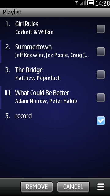
The CheckBox component is used in the playlist delegate to provide the selecting functionality in the remove mode.
 CheckBox {
     visible: removeMode
     anchors.centerIn: parent
     checked: selected
 }
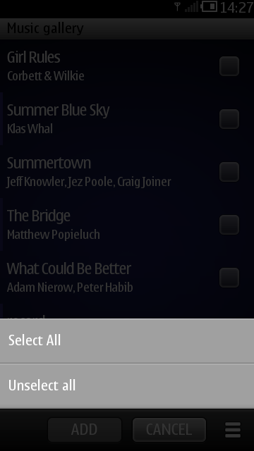
In the remove mode the PlaylistPage also provides a menu for selecting/unselecting all items. The menu is implemented using a Menu component populated with MenuItem components.
 Menu {
     id: viewMenu

     content:
         Column {
             width: viewMenu.width

             MenuItem {
                 text: qsTr("Select All")

                 onClicked: {
                     viewMenu.close()
                     for (var i = 0; i < player.playlistModel.count; i++)
                         player.playlistModel.setProperty(i, "selected", true)

                     numOfSelectedItems = player.playlistModel.count
                 }
             }

             MenuItem {
                 text: qsTr("Unselect All")

                 onClicked: {
                     viewMenu.close()
                     for (var i = 0; i < player.playlistModel.count; i++)
                         player.playlistModel.setProperty(i, "selected", false)

                     numOfSelectedItems = 0
                 }
             }
         }
 }
PlaylistPage has two ToolBarLayout items. Each ToolBarLayout defines a toolbar with several ToolButtons. One toolbar is shown in the default mode and the other is shown in the remove mode. The default tools in the PlaylistPage allow the user to navigate back to the controls page, navigate to the music picker page to add songs, or to switch to the remove mode. The tools in the remove mode allow the user to confirm or cancel the removal or to bring up the menu for selecting/unselecting all items. Changing between the two ToolBarLayouts is done by calling the ToolBar's setTools method with "replace" transition.
toolbar.setTools(removeTools, "replace")
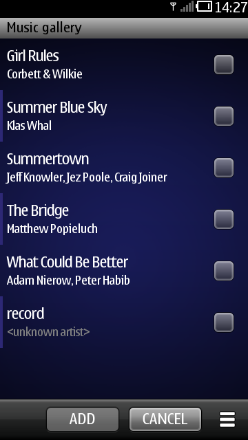
GalleryPage is used as a music picker page on platforms where Qt Mobility's Document Gallery API is supported. It provides a list of all supported audio files on the device.
In GalleryPage the user can add songs to the playlist. This is done in the same way as removing songs in the PlaylistPage's remove mode: the user selects the songs to be added and then confirms that the songs should be added to the playlist. GalleryPage also provides a menu for selecting and unselecting all songs.
The DocumentGalleryModel component from Qt Mobiliy APIs is used as the data model for the ListView in GalleryPage. It provides the artist, title, file path and duration information of all accessible and supported audio files on the device.
 DocumentGalleryModel {
     id: galleryModel

     rootType: DocumentGallery.Audio
     properties: ["artist", "title", "filePath", "duration"]
     sortProperties: ["artist", "title"]

     onCountChanged: {
         selection.clear()
         for (var i = 0; i < count; i++)
             selection.append({"selected": false})
     }
 }
As the model is not custom made for this demo, we can't just add a "selected" property like was done in the playlist. Instead, an additional ListModel is used to hold the selection status for each item in the document gallery model. We use the DocumentGalleryModel's onCountChanged signal to keep the selection model's item count equal to the gallery model.
 ListModel {
     id: selection
 }
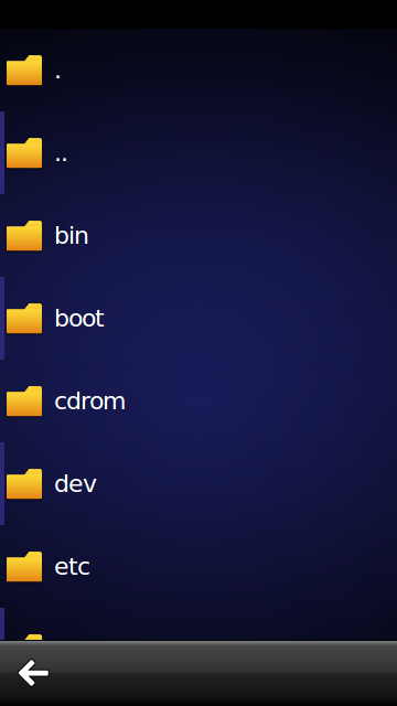
FilePickerPage is used as a music picker page on platforms that don't support the Document Gallery API. It provides a simple single-select view for adding a song from the file system to the playlist. The data model used is the FolderListModel in the Qt labs folderlistmodel plugin.